overview
ProVenue
Background
ProVenue is a back-office ticketing solution utilized by venue staff and box office personnel. With robust capabilities, the ticketing platform serves as the interface for event & venue configuration, ticket management, account management, inventory allocation, and much more.
Role
Lead UX Designer
- UX + UI Design /
- Visual Design /
- Frontend Dev /
Project Status
🚀 Launchedchallenge
Understanding the Problem
Comparable to MyProVenue, ProVenue suffers from a fair amount of technical debt. The primary cause of concern was the utilization of Flash within the application. Key features such as the ticket designer and the venue designer were built on the foundation of Flash.
Similarly, the overall design and experience of the application shared the same dated characteristics. Partially due in part to the addition of features over time, the original design patterns remained. Further compounding the issue was that with each new addition, the experience became a little less intuitive.
With this in mind, we identified high priority areas of focus which are the following:
- Strategize creative and development efforts for aspects of the application that was built with Flash as the foundation.
- Identify and address areas of friction while minimizing pain points within the experience.
- Leverage similar design patterns established within MyProVenue and MPV Control Center to maintain cohesiveness within Tickets.com's software offerings.
- Design with a sense of modularity that lends itself to development phases.
solution
Ideation and Solutions
Technologies
With the knowledge gained from recent application overhauls, we chose to utilize CSS3, SASS, Angular JS, and SVG as the application's technology enhancement. As we were now fairly proficient with these languages, we were confident that they would serve us well during the redesign. Additionally, this would provide us with the capability of leveraging existing functionality found within MyProVenue.
Conceptualizing the Design and Experience
Understanding that the redesign would be implemented in phases, we first had to make sense of the tangled web of intricacies. The primary task was to identify pain points within the experience and strategizing the information architecture. Recalling user feedback, we found that oftentimes, users would have to navigate from section to section to complete a given task. With that in mind, our goal was to recreate the experience in a manner that lends itself to efficiency.
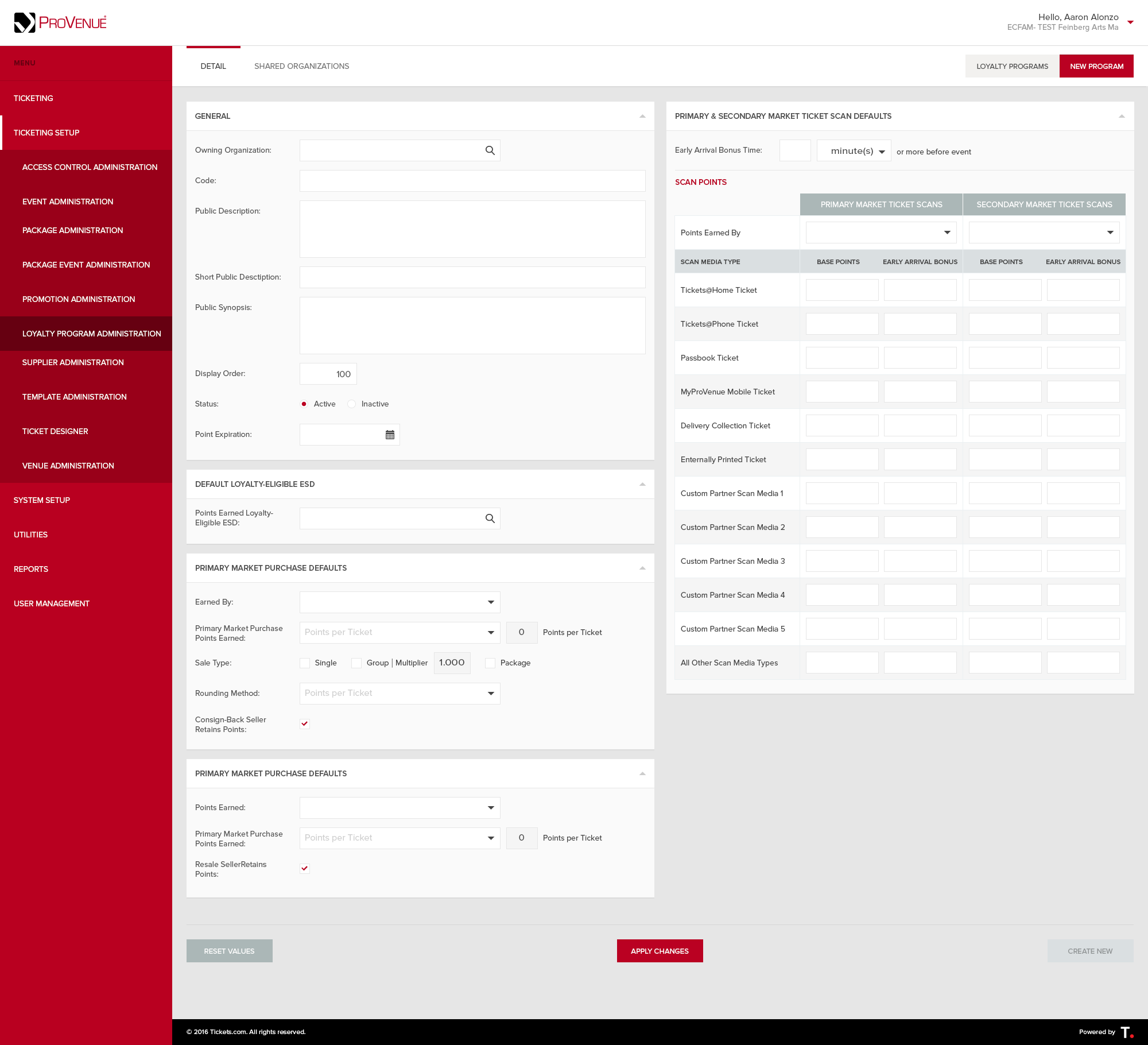
Our starting point, ProVenue prior to the redesign.

With follow-up feedback from client representatives and box-office personnel, we found that key areas of friction primarily resided in the secondary and tertiary tiers of the information structure. Considering the feedback, we restructured the main navigation elements to better match the parent category. Subsequently, our user feedback improved regarding that portion of the application.
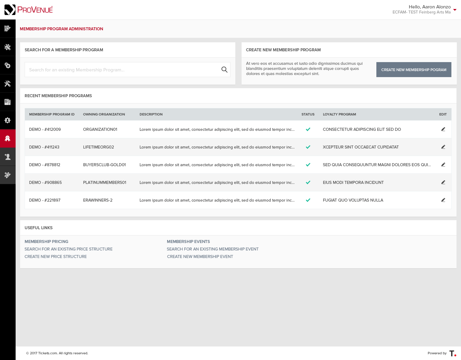
The next step was to identify a portion of the application that didn't rely too heavily on dependencies. This would serve as our entry point as we planned on a modular, incremental design introduction. Focusing on self-sufficient portions of the application, we identified the Membership & Loyalty flow as it was fresh off a development cycle. With our entry point selected, it was time for a first pass at the redesign.
Initial Design of a more modern, ProVenue.
Feedback from the first design approach was both positive and informative. Shedding light on hardware limitations, we had to consider the minimum screen resolution commonly used by box-office personnel, 1280px by 1024px.
Additionally, we had to account for the fact that the application was in production and utilized by clients daily. Implementing a design that shifts from horizontal to vertical navigation within the experience would prove both jarring and confusing. With new requirements identified, I went back to the drawing board.
A reiteration of the initial design that features horizontal navigation.

The latest iteration of the design remedied the issues we were encountering prior. With the added familiarity of the horizontal navigation, we maintained consistency between the new and the old. Furthermore, the approach was to implement a fluid design that targets the lowest resolution first. This would ensure that the application maintained usability while scaling up to accommodate larger, more modern displays.
Knowing that we were on the right path, additional functionality that enhanced the user experience was now the path forward. Cosideration points were as follows:
- Incorporate a guided approach that eliminates the pain points concerning navigating from section to section to complete a task.
- Employ "just-in-time" enhancements that provide additional functionality given the user's task at hand.
- Design a means of dismissing/hiding completed sections.
- Modularize the overall design in a manner that lends itself to phase implementation.
Furthering Enhancements
Concerning the first item on the list, the vision was to provide the user with an efficient yet clear path forward within a given task. With that in mind, the incorporation of secondary breadcrumb navigation came into play.
Advancing the concept of a guided experience, the addition of the "next step" call-to-action button was included within the same hierarchy level. Located on the right of the page, this would denote "moving forward" throughout the given process.
Regarding "just-in-time" enhancements, a contextual menu was introduced to highlight related actions based on the user's current location within an experience. This addition also touched on the concept of providing our users with a guided approach.
In terms of the dismissal or hiding of completed sections, the vision was to not prolong the experience by adding additional steps. Rather, it was to maintain access to pertinent data while providing the option to hide completion sections. This provided our users with the ability to reference prior input values and hide them when not needed.
In the context of design modularization, the first mission was to identify a single, global component that could bridge the gap between the old and the new. After assessing the limited pool of candidates and considering the dependency factor mentioned previously, our target component was the application's primary navigation. An updated, modern primary navigation would serve as an introduction to the new UI that would mitigate the shock factor when first utilizing the Membership & Loyalty portions of the application.
Closing Thoughts
To summarize the key accomplishments, a breath of new life was instilled within the robust application. Improvement on multiple fronts, the technology set, design, and experience were modernized. As this effort was a small project in the grand scheme of things, the changes made paved the way for future updates to the application that would carry throughout.
contact
If you're interested in collaborating, reach out and hit that link above!