overview
MyProVenue
Background
MyProVenue, also known as MPV, was the first large-scale project I worked on when I started my tenure at Tickets.com. As the lead UX Designer, I was tasked with creating a responsive, mobile-first ticketing experience that catered to Major League Baseball, world-class theatres, college venues, and more.
Role
Lead UX Designer
- UX + UI Design /
- Information Architecture /
- Frontend Dev /
- User Research /
Project Status
🚀 Launchedchallenge
Understanding the Problem
With the continuous evolution of technologies in the webspace and the fact that ProVenue Online (soon to be MyProVenue) was still utilizing Flash as its venue foundation, it was an opportunity for a fresh start. It was time to embrace more modern tech and take the chance to reimagine the application in its entirety. More importantly, the overall usability of the application needed to be addressed as mobile ordering was the way of the future. Additional items for consideration were the following:
- The ability to cater to a wide range of venues, whether it was an MLB Club or a quaint, small-town theatre.
- Venue maps in HTML5 or SVG? What about other technologies?
- Responsive with a mobile-first approach!
- To add to the responsive strategy, where was the starting point?
solution
Ideation and Solutions
Technologies
At the time, the current iteration of ProVenue Online was essentially an interactive website that provided users with the ability to purchase tickets. Built with tried and true programming languages, the vision was to reimagine the experience while maintaining accessibility through a web browser. With that in mind, we considered the current, yet stable, technologies available.
Through research and comparative analysis, we opted to leverage CSS3, SASS, Angular JS, and SVG. With my background in frontend development, I pitched CSS3 because it provided us with the ability to hone in on the mobile-first approach with the usage of @media queries. From there, we saw the incorporation of SASS for both better housekeep and modularity.
Planning the User Journey
Based on the current shopping experience and the feedback gathered from our clients & users, we identified two main methods of how our users shopped. The first of the two was more granular, an experience that provided users with the ability to select their seat in their preferred location. In contrast, the second approach presented the user with options based on their filter criteria. With our flows identified, the next task was to establish a baseline for each experience while identifying pain points and minimizing friction.
Once the initial mapping of the journey was complete, the experience was broken down into three smaller, more manageable flows to facilitate our focus. The key areas of focus were the following:
- Select by Seat - The lengthier of the two journeys but also provided the most flexibility.
- Best by Section - Quick and easy was the means forward as this path presented the buyer with optimized offerings based on their filter criteria.
- Shopping Cart - The avenue that both paths shared as they completed the shopping experience.
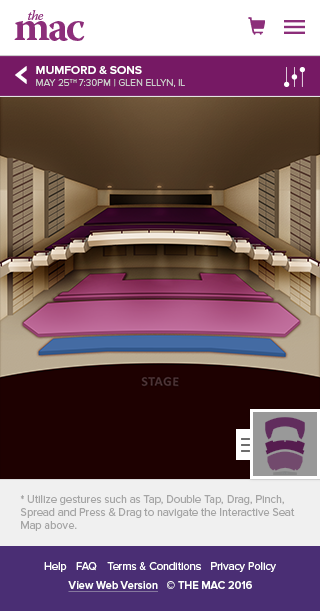
Below is the initial design that depicts a portion of the Select by Seat experience.
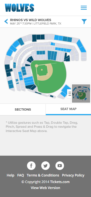
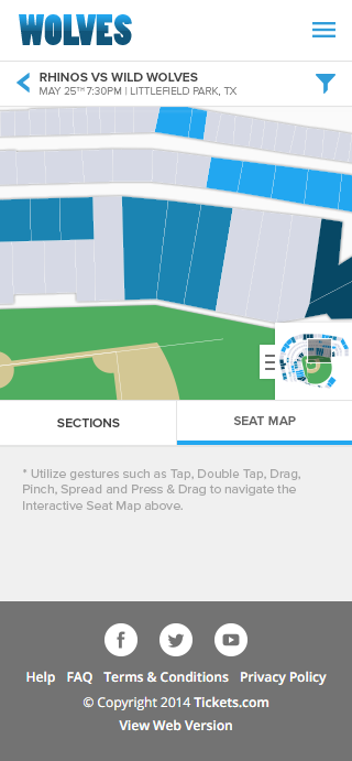
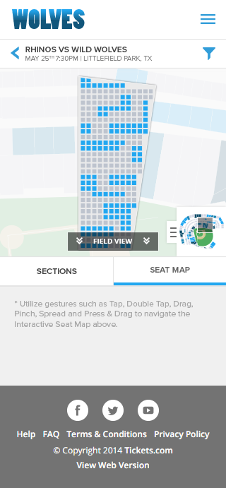
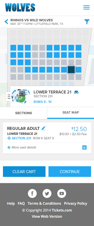
Through prototyping and testing, we discovered that our initial attempt was rather labor-intensive. The sequence required entirely too many steps to arrive at the seat selection process. To add, we found that the lowest target resolution, an iPhone SE, had its limits in terms of usable real estate. Moving forward with new ideas and iterations, we were determined to find the right experience.
Below is an iteration of the Select by Seat experience that better utilized the space on the lowest target resolution.
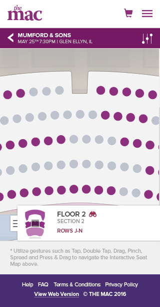
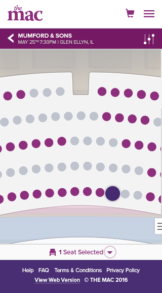

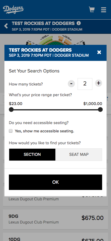
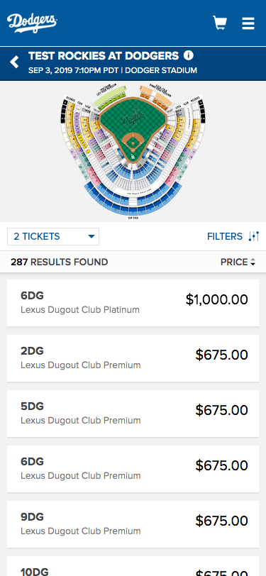
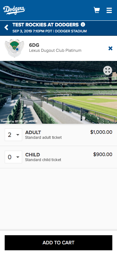
With the Select by Seat flow in good form, it was time to shift gears and focus on the Best by Section experience. In contrast to the previous experience, we discovered that this journey, while lacking granularity and control, presented a quicker path to the checkout process. The task of selecting specific seat(s) was left to the application, while the user simply needed to update or confirm the preset filter criteria.
The conditions identified which had the most impact on the purchase experience were the following:
- The number of tickets they were shopping for.
- The price range that they were willing to spend per ticket.
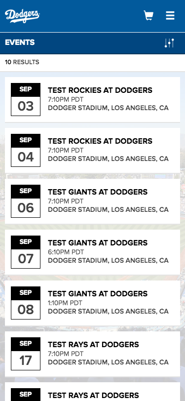
With the key criteria defined and understanding that the filtering mechanism was the basis of how the application delivered results, the plan was to display the component at the earliest opportunity. Additionally, the filter was prepopulated to facilitate common shopping patterns and a wide range of price points. Below is a depiction of one of the first passes at the filter design.
As testing began with the Best by Section experience, the focus was now on the Shopping Cart. Due to the nature of ticketing and the fact that events have the capability of selling out rather quickly, expedience and efficiency were high on the priority list.
First up to bat was account validation as this set the cadence for how fast a user could traverse through the cart. If the user had an existing account, billing & shipping information would likely be stored. Meaning, in just a few taps or clicks, the user would have their tickets.
On the other hand, if the user did not have an account, the goal was to obtain the least amount of information required to create an account and progress through the flow. By considering our current account creation requirements, we identified name, email, and password as the essential data points.
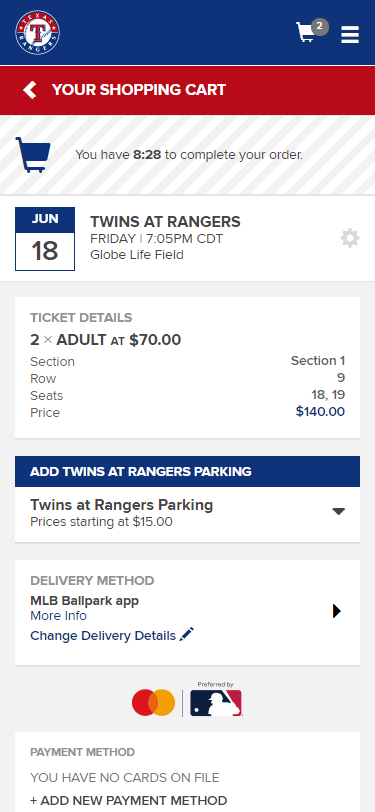
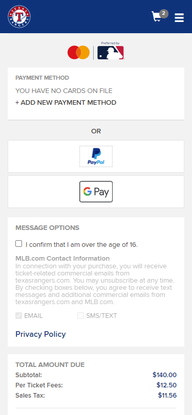
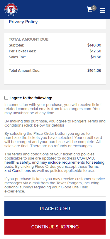
With the validation aspect covered, the vision was to present the cart in a manner that was both modular and concise. Through comparative analysis and AB testing, we found that a single-page cart would work the best concerning ease of use and efficiency. Additionally, with the implementation of electronic ticket delivery and secondary payment methods such as PayPal, Google Pay, and Apple Pay, the user could complete the checkout process in a matter of minutes.
Closing Thoughts
Since the launch of MyProVenue, our clients have expressed positive feedback due to ease of use and efficiency gained when compared to the older application. With the use of SVG maps and CSS3/SASS, we have the capability of redefining an experience to match their given brand identity with a few updates to variables. As MyProVenue services nearly half of the MLB Clubs and a multitude of other types of venues, both small and large, I look forward to seeing how the application grows.
contact
If you're interested in collaborating, reach out and hit that link above!