overview
Alfred
Background
Alfred works with the ProVenue Ticketing system as the all-in-one intuitive ticket validation interface. Initially designed for handheld mobile devices, Alfred has grown to become a self-service access interface that can accept traditional tickets, digital tickets, contactless tickets, and NFC.
Role
Lead UX Designer
- UX + UI Design /
- Visual Design /
- Frontend Dev /
Project Status
🚀 Launchedchallenge
Understanding the Problem
Due to the fast-paced nature of ticket taking, the vision was to create a mobile interface that provided an extremely efficient yet intuitive experience. With the current hardware offerings at our disposal, the device's viewport size was limited to 320px by 568px. Furthermore, as time is of the essence in the ticket-taking world, scrolling would need to be kept to a minimum. Additional areas of concerns included the following:
- Design an interface that ties into the existing ProVenue design patterns.
- Strategize information structure with emphasis on maintaining visibility on key data without scrolling.
- Design efficient and intuitive messaging alerts regarding ticket statuses.
solution
Ideation and Solutions
Form Factor
As ticket-taking devices differ from your larger, store-bought mobile devices, there are many aspects to consider when designing within a limited resolution. First and foremost, we had to keep in mind that less is more. With a working space of 320px by 568px, we needed to design an interface that was easily consumable while emphasizing key data elements.
Next, the vision was to enhance the "less is more" approach while considering the implementation's power draw. As the ticket-taking device utilized LCD technology, a lighter color palette was the primary choice as it lends itself to less battery usage. Taking it one step further, we limited the usage of visual graphics to that of the Alfred icon and main control iconography.
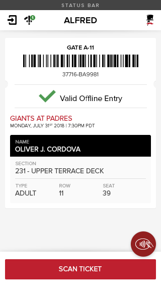
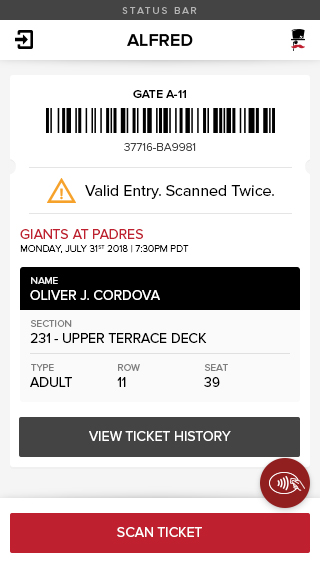
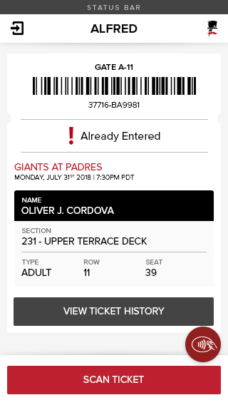
Lastly, we needed to design a ticket scanning alert pattern that was both eye-catching and informative at a glance. Again, to reference the fast-paced environment that venue staff work in, quick feedback as to whether a ticket is valid or not is imperative.
Conceptualizing the Design and Experience
With a better understanding of our approach method and form factor, it was now time to shift focus and develop a design strategy. The immediate task was to identify the data elements that demand the most attention. Considering the usable real estate we had available, establishing key data points would ensure that everything was accounted for as we progressed through design iterations.
Through interviews with client representatives, we determined that the following data elements were of the most importance:
- Ticket Barcode - The fingerprint in the ticketing world.
- Ticket Scan Status - A configurable string that varies from client to client.
- Event Title & Description - Datapoint that confirms access to the correct event.
- Ticket Holder Name - This grants venue staff the ability to greet the attendee by name, adding a sense of personability.
- Section, Row, Seat, and Ticket Type - Supplemental ticket details.
- Quick Access to Ticket History - A history of location scans within the venue and past admittance and exiting.
- Scan Actions - Both NFC and Barcode Scan methods.
With the discovery of key information points behind us, it was time to make use of the knowledge gained and begin the design phase. Our first pass included many of the design characteristics found within ProVenue. As the two applications were meant to work hand-in-hand, it made sense to implement similar patterns.
Below is the initial design that incorporates the key data elements identified by our client representatives.

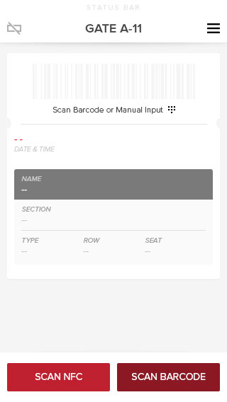
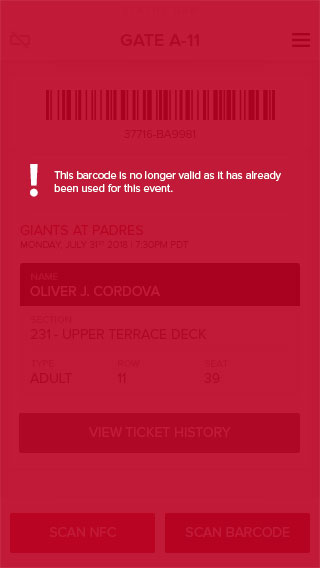
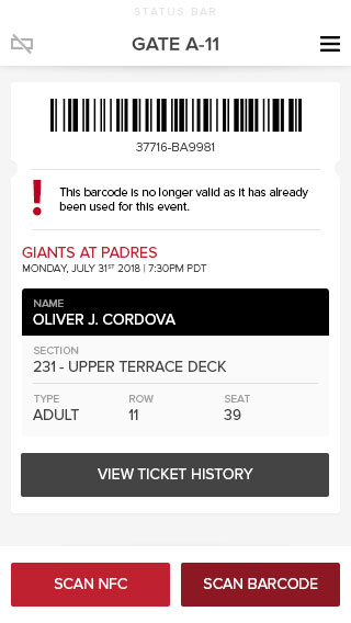
The outset design was well received by both internal staff and our subset group of venue staff. Positive feedback from venue staff suggested that Alfred felt like an extension of ProVenue with an efficient and easily consumable interface. While most of the feedback was positive, we also received feedback that brought to light usability concerns regarding the Scan buttons.
The chief concern was not in direct relation to the actual design, it was with the overall bulkiness of the handheld device and the impact it made regarding usability. In contrast to personal mobile phones, ticket-taking devices often have a multitude of components added on. Additional external batteries, scanning paraphernalia, protective cases, and lanyards are common additions to the base device. With everything taken into account and depending on the user's dominant hand, reaching for the furthermost scan button proved to be a bit of a reach. Undoubtedly, we needed to address the usability concern and reiterate the design.
A design iteration that leverages a full-width primary scan button in addition to long-press functionality which accesses NFC scan.
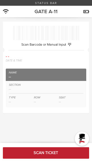
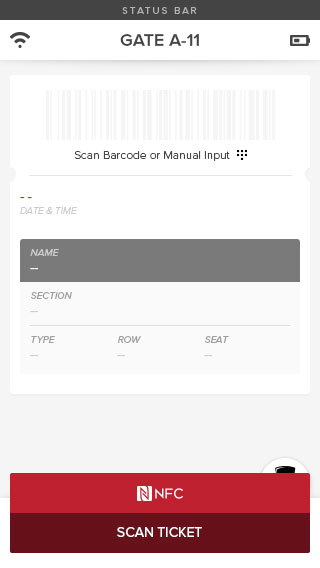
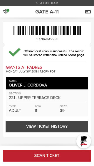
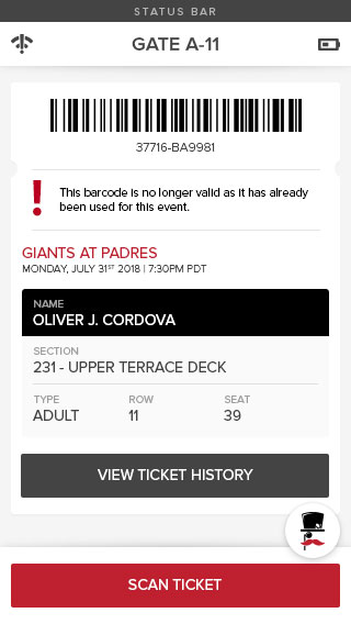
The next iteration utilized a full-width scan button that didn't play favorites in terms of left or right-hand dominancy. As the entire width of the device was used to depict a single scan action, we had to get creative concerning the location of the Scan NFC button. Rather than placing the secondary action above the primary and decreasing usable real estate, the Scan NFC functionality would be located beneath a long-press function. In other words, if the user were to press and hold the primary scan action, a secondary scan action would display as a drop-up menu option.
While this design approach solved the far-reach issue we were encountering, it also presented additional areas of concern. The aspects to consider were the following:
- The long-press functionality didn't lend itself to expedience and efficiency.
- Placing the Scan NFC beneath the primary scan action increased the amount of input required from the user.
- The task of scanning multiple NFC codes in succession proved to be extremely tedious.
Recognizing that the design was on the right path, I pressed on intending to maintain efficiency and leverage the accessibility of a full-width primary action. The main hurdle was the location of the secondary NFC scan action. It needed to be quick, repeatable, and accessible via a 1-tap input method. Furthermore, it couldn't consume additional vertical height as the extension of a scroll bar would be a show-stopper.
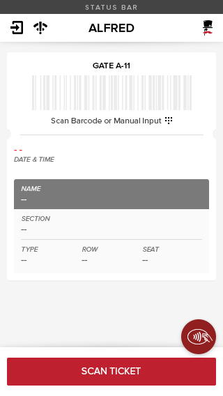
Ultimately, I ended up sacrificing the floating menu as the tasks associated weren't of primary concern. Secondary application options such as accessing the reports and configuration pages lived in the floating menu up until that point. In hindsight, those options didn't demand that amount of visibility. While it was a nice touch, the location was better suited for the NFC Scan action.
To address the issue of left and right-hand dominancy, the floating menu was implemented in a manner that was configurable based on user preference. Once a user logged into a device with their credentials, they could move the floating menu to the left or right via a settings menu option.
The final design revision that surfaced the NFC Scan action.
Closing Thoughts
In summary, we were able to deliver a handheld extension of ProVenue that was both efficient and intuitive from a ticket-taking standpoint. Utilizing every pixel available, key data points would remain visible without the need to scroll or illicit additional user input. Lastly, we ensured that key actions would require the least amount of repeatable input while minimizing the application's power draw.
contact
If you're interested in collaborating, reach out and hit that link above!